Fact Check – Solar Land Space Needs
I am still working on reviewing the EPA Clean Power Plan analysis (Paper #1, Paper #2, Paper #3). I am currently running multiple dispatch simulations to produce an impact analysis using AuroraXMP. However, I got distracted from a twitter blog that showed the solar land requirements for the world to be extremely small. See blog screenshot below.
I traced the source to this paper from a student who wrote it for their Diploma Thesis. On page 11 & 12 of their report are the claim and the graphic being spread on the internet. The first issue which should jump out is the statement “If a solar electricity yield of 250 GWhel/km² is taken as base ….” Doing a little research one can conclude at best that yield is off by 3X per the latest by National Renewable Energy Laboratory (NREL). In addition, the world electric consumption seems to be a little low in the assumption used 16,076 TWh/y vs. 20,280 TWh/yr.
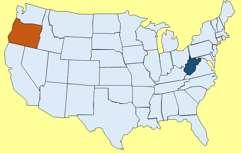
If we recompute the numbers using a low estimate of land use per NREL of 3 acre/GWH-yr, the state of Oregon becomes the world size requirement versus the analysis which was closer to the size of West Virginia. West Virginia is more represented of the US requirement. This is not including the need to get battery storage and transmission. Battery storage size would be much smaller – less than Rhode Island. However land requirement is only one piece of the puzzle. Data source for state area.
The initial capital cost of such endeavor would be at least twice as large as using natural gas generation. Utility scale solar cost is at best around $2000/kW – then a utility scale battery would add another $500/kW versus a brand new gas plant which is around $1000/kW. The gas plant does have a significant variable cost, but as many of you know who have to budget your money, the best decision for the long-run sometimes cost too much given your current capital constraints. The trend for de-regulation for the generation business puts a greater limit on the ability to make these longer term decisions.
Lesson learned always check your facts when it comes to energy related discussions. It is too easy to manipulate the facts, because there is so much data and few go deeper to find the truth. The truth shall set you free.
Back to EPA analysis – stay tune….
Your Energy Consultant in Search of the Truth,
David
David K. Bellman
All Energy Consulting LLC- “Independent analysis and opinions without a bias.”
614-356-0484
[email protected]
@AECDKB
blog: https://allenergyconsulting.com/blog/category/market-insights/
#2 Clean Power Plan Assessment – Market & Engineering Perspective
Before I continue with my assessment of the Clean Power Plan, I want to reflect and comment on what I have discussed in the first post. Let me make this clear, there is NO congressional action needed to make this happen. This is all being done through the Clean Air Act.
The fact that EPA is using a rate based mechanism does not preclude it from hitting a ton reduction given this is being applied to the existing fleet. Plus, they are limiting the new plant options. The only way to exceed the tonnage barrier is to add to the denominator of the rate (lb/MWh). Energy efficiency programs (EE) and renewables can be counted to the MWh. The limits they proposed from their Excel spreadsheet are based on very aggressive and large reduction-given they are starting with the 2012 lowest gas to coal price spread. (as noted in the previous discussion) Then, they modify the coal to be more efficient plus re-dispatch more gas and then adding Nuclear, Renewable, and EE/DSM efforts to the denominator to produce state by state CO2 rate lb/MWh. Because this calculation is only on existing units, it is not likely to be able to increase significant volume of CO2 from those plants as some discuss. The rate will be highly dependent on being able to achieve and/or over achieve the Nuclear, Renewable, and DSM/EE efforts as they calculated. This leaves room for total tons of the entire fleet (new and old) to be greater, but this will not come from the existing fleet. Also, given the renewable and DSM are quite high targets, the tonnage level will not likely exceed to what they are targeting-which is “Nationwide, by 2030, this rule would achieve CO2 emission reductions from the power sector of approximately 30 percent from CO2 emission levels in 2005.”
This is a perfect transition to continue with the assessment of the Clean Power Plan. The next BSER and the most impactful block is “Reducing emissions from affected EGUs in the amount that results from substituting generation at those EGUs with expanded low- or zero-carbon generation.”
In this section, they discussed the role of nuclear. This is the smallest impact, even less than the coal unit efficiency improvement. Adding CO2 cost will likely keep many of the nuclear fleet from retiring. The re-license cost has grown for nuclear fleet given all the recent issues with nuclear. Some estimates show cost to re-license greater than 4X the cost of a brand new gas plant. Given the limited impact of nuclear, I will limit the discussion and move on to the largest piece of the puzzle, Renewable.
EPA is focused on wind and solar renewable. They note they left out biomass. The renewable piece is a tale of two calculations. The effects of the option 1 BSER, according to the EPA IPM results, are minimal on the actual renewable capacity. Less than 10% change in capacity was observed from the base to option 1. Producing a CO2 price should certainly incentivize more renewable and nuclear generation. On an annualized basis, non-hydro renewable generation is growing 2% a year. This certainly seems to be reasonable-if not conservative-given the last ten years has seen double digit growth in renewable generation. However, there is a big difference in the IPM file and the Excel spreadsheet. In the Excel spreadsheet, renewable generation is shown as almost 50% higher than the IPM option1 case. I am not sure what to make of the difference. In the spreadsheet case, it is still not unreasonable to assume a 4% growth in renewable generation in a year. This would require artificial support which could be in the form of Renewable Energy Credits (REC), CO2 price, and/or tax credits. In terms of incremental cost over the IPM model, if we assume the difference in MWh, the associated capacity factor of 0.3, and the capital cost for renewable of ~$2000/kW this calculates 63 GW at cost of $127 Billion.
My concern is more in the distribution of the renewable versus the total. EPA initially examined the renewable potential by 6 regions. In their own words: “EPA estimated the aggregate target level of RE generation in each of the six regions assuming that all states within each region can achieve the RE performance represented by an average of RPS requirements in states within that region that have adopted such requirements. For this purpose, EPA averaged the existing RPS percentage requirements that will be applicable in 2020 and multiplied that average percentage by the total 2012 generation for the region. We also computed each state’s maximum RE generation target in the best practices scenario as its own 2012 generation multiplied by that average percentage. (For some states that already have RPS requirements in place, these amounts are less than their RPS targets for 2030.) For each region we then computed the regional growth factor necessary to increase regional RE generation from the regional starting level to the regional target through investment in new RE capacity, assuming that the new investment begins in 2017, the year following the initial state plan submission deadline,153 and continues through 2029. This regional growth factor is the growth factor used for each state in that region to develop the best practices scenario. Finally, we developed the annual RE generation levels for each state. To do this, we applied the appropriate regional growth factor to that state’s initial RE generation level, starting in 2017, but stopping at the point when additional growth would cause total RE generation for the state to exceed the state’s maximum RE generation target.”
This all makes sense until you think about the market perspective and the actual reality of this approach. Historically, the areas with the greatest renewable development generally have two characteristics – high power price and/or an abundance renewable generation opportunity. The barrier to jump to alternative power source was minimal, such as the case in California compared to states with low power prices Kentucky and West Virginia. These states with much lower prices will have a greater impact in moving to a more renewable system. Their economy is not centered on high power prices. The jump to this higher value will be significant. West Virginia growth in renewable is 1000+%. In West Virginia’s case, EPA is asking the state to invest in a more expensive, but cleaner power source. If we assume the same assumption above, then WV’s needs ~3.6 GW of wind capacity with a total cost of $7 billion dollars. If we spread the cost with West Virginia retail sales over the next 20 years it would still cause a rate impact of 14%. I did a state by state analysis on this renewable piece – if you are interested email me[email protected]
Let me pause here for further digestion before moving onto the EE/DSM portion of the plan.
We can help the policy discussion in terms of running independent assessment and helping develop strategies to best plan for the future.
Please contact us 614-356-0484 or[email protected]
Your Inspired Energy Consultant,
David
Founder & Principal
All Energy Consulting LLC
“Independent analysis and opinions without a bias.”
614-356-0484
[email protected]
blog: https://allenergyconsulting.com/blog/category/market-insights/
Clean Power Plan Assessment from a Market and Engineering Perspective
There are many reviewing the recent EPA – Clean Power Plan. Many argue from a policy perspective and rarely actually review the details and the numerical results. In this discussion, I will share with you my initial takeaway from reading the 645 Clean Power Plan along with hundreds of other pages in the Technical Source Document (TSD) plus the Excel files supplied. In addition, I did use my Power Market Analysis (PMA) model to validate and cross check some of the results.
Let me first give some background to those who do not know me. I am a Chemical Engineer from the University of Texas at Austin (hook’em horns) by training, however I have spent most of my professional life in analyzing and understanding energy markets (Purvin & Gertz (now IHS), Deloitte Consulting, American Electric Power). Please don’t hold the American Electric Power experience as a foretold bias on coal. I have served on the National Renewable Energy Laboratory (NREL) technical advisory panel so I do know the issues and trends of renewable power. My fellow panel members would vouch for my impartial attitude. I am a numbers person who holds not personal bias other than the desire to optimize the numbers. Truth be told, I was a leader in the AEP organization in terms of indicating the need to diversify and support gas investments even as gas markets were soaring, as my groups long-term forecast indicated prices to settle between $5-7/mmbtu for my entire tenure at AEP (2002-2010), to the angst of many AEP colleagues. My forecasts are not driven by personal biases or political motivation, but the desire to understand and know the markets. I live by the University of Texas motto “The Truth shall set you free”.
I have approached the Clean Power Plan Assessment in a similar fashion. I am opened minded on the need and societal desires to be cleaner. Striving to have a positive or the least negative impact on the earth will always be a good intention. As long as people are clear on the cost and potential gains, I would not challenge the path society has chosen.
There is so much one can note on a 645 page plan. The document was repetitive in several places – the ironic thing is on page 581 there is a note on the Paperwork Reduction Act. I was taking my own notes as I read the document. My notes ended at 17 pages. I have reorganized my thoughts to hit the most impactful points first.
I think the very first thought that should rush into everyone minds is the rate focus EPA has. The EPA, compared to many of the previous emission reduction goals, is now pushing a rate based target (lb/MWh) vs. a tonnage limit as seen in SO2, NOx, and even the initial HG program. They do offer the option of mass based target, but clearly favor the rate based approach. This took many nights to truly understand and absorb all the nuances as to why this is the case. The first thing in order to understand this approach is to understand the rule is focused on EXISTING units and those recently under constructed. This is a key issue on why the buildings of new gas plants are not listed as an option for Best System of Emission Reduction (BSER). Currently the new gas plants will likely be limited by section 111(b) of the Clean Air Act (CAA). “In January 2014, under the authority of CAA section 111(b), the EPA proposed standards for emissions of CO2 from newly constructed fossil fuel-fired electric steam generating units (utility boilers and integrated gasification combined cycle [IGCC] units) and for natural gas-fired stationary combustion turbines.” The limits proposed for new gas plants would be an achievable solution for 24 states. The other states will have to go lower than gas plants. For this reason, I suspect the gas plants were not a BSER solution nor were they discussed for more than a few paragraphs.
The rate method also allows an “easy” way to give value and credit to EE and renewable projects. There seems to be some conflict in allowing this given the plan currently notes: “Based on the EPA’s application of the BSER to each state, the EPA is proposing to establish, as part of the emission guidelines, state-specific goals,expressed as average emission rates for fossil fuel-fired EGUs.” However by allowing EE and Renewables to modify the rate calculation, it seems to have conflicted with the above statement. The argument is made that EE and renewable generation can be attributed to the affected EGU. “A MWh crediting or adjustment approach implicitly assumes that the avoided CO2 emissions come directly from the particular affected EGU (or group of EGUs) to which the credits are applied”
EPA spent much time focused on their BSER suggestions laid out in four blocks:
“1. Reducing the carbon intensity of generation at individual affected EGUs through heat rate improvements.
2. Reducing emissions from the most carbon-intensive affected EGUs in the amount that results from substituting generation at those EGUs with generation from less carbon-intensive affected EGUs (including NGCC units under construction).
3. Reducing emissions from affected EGUs in the amount that results from substituting generation at those EGUs with expanded low- or zero-carbon generation.
4. Reducing emissions from affected EGUs in the amount that results from the use of demand-side energy efficiency that reduces the amount of generation required.
Based on that evaluation, the EPA proposes that the combination of all four building blocks is the BSER”
The EPA first BSER seems to be somewhat of a red herring. They spent quite some effort only to conclude a small impact. I oversaw a paper on power plant efficiency for the National Petroleum Council Hard Truths. A very similar conclusion is shown in that only a few percentages are likely to come from an existing unit improvement. This impact is the smallest by many percentages compared to blocks 2-4. I do have concerns in their extrapolation for opportunities for improvement in the existing US coal fleet. In their spreadsheet model, they take 2012 generation and assume a 6% improvement. The issue I quickly see with this math is the fact the likely remaining coal units that are running after 2020+ are likely the best of the best coal units to begin with. These coal units did not get to be the best ignoring best practices, therefore the remaining coal units will have much less opportunity to improve heat rates compared to the units that will likely be retiring (From EPA own analysis 72 GW 2016 to 101 GW by 2030 (cumulative)).
The second block is the most interesting block in my mind. It is also the second most impactful of the blocks only few percentages away from #3. When dispatched is discussed, one should quickly jump to market conditions. A dispatch of power plants is largely driven by load and fuel commodity price relationships. The first issue, largely perhaps by coincidence and unintentional is their use of 2012 data. Out of all the years one could choose, 2012 is probably the LEAST likely year in the future in terms of commodity price relationships. The spread between coal and gas prices was less than $0.40/mmbtu. Nowhere in the forecast is this price spread being predicted. In the models being used, the spread is closer to $3/mmbtu. This produces an abnormal level of coal generation to start their calculation of targeted rate. In order to get gas units to perform in the 70% utilization range, retirement of existing coal unit and/or the spread of the fuel cost need to narrow. Using a carbon cost will narrow the economics. I did run a 2016 carbon case with $30/ton, and it did produce NGCC utilization rates close to 70%. Therefore there is an agreement with the statement “For the scenario reflecting a 70 percent NGCC utilization rate, comparison to the business-as-usual case indicates that the average cost of the CO2 reductions achieved over the 2020-2029 period was $30 per metric ton of CO2”. What I will be concerned with is the statement “Projected wholesale electricity price increases over the same period were less than seven percent in both cases, which similarly is well within the range of historical electric price variability” I think they are referring to the gas price change impact due to more demand. However the question really should be the impact of making the gas units 70% utilized which is done by adding the $30/ton carbon cost. The 7% increase would seem very unreal with the math of only dispatching difference and carbon of $30/ton. When I model 2016 with and without $30/ton carbon, it results in significant price increases. PJM-West prices rise 50%. In terms of total system impact, the 2016 case without carbon is showing total US energy revenue for all the plants of $168 Billion. Adding carbon increases the energy revenue to $253 Billion, an increase of 51%. It is possible to lower the cost as certain markets are closed system and may not pass the cost directly to the consumer. However, market principle for the majority markets would apply and this is increasing as more utilities de-regulate their generation. Another potential for price increase mitigation could be if they model more than block 2 and included renewables. Renewable PPA deals do collapse the wholesale market, but those cost show up on the retail prices. However they discussed this in the block 2 discussion. There are regions where prices move up only 17%, but, on average, prices are up 50%. This brings up another can of worms in terms of state impacts from one to another. Out of the hub reporting I am looking at, Indiana will be the biggest hit. I am at loss to understand the minimal discussion of energy price impact of $30/ton carbon cost. A true impact study should show the case where coal units are running and then adding carbon cost to essentially push out coal units should be the comparison. They do note the multi-pollutant benefits, counter to that they should also identify the multi-pollutant cost by modeling a business as usual case (no MATS, CSAPR, CPP, etc…).
There is much to digest here so I will pause before discussing blocks 3 & 4.
We can help the policy discussion in terms of running independent assessment and help develop strategies to best plan for the future. Please contact us 614-356-0484 or [email protected]
Your Inspired Energy Consultant,
David
Founder & Principal
All Energy Consulting LLC
“Independent analysis and opinions without a bias.”
614-356-0484
[email protected]
blog: https://allenergyconsulting.com/blog/category/market-insights/
Extreme Weather Impacts to Gas Storage and Price
We have recently added a new feature in our gas model allowing users to upload their own forecast for the natural gas markets and to use the tool to produce your power sector demand. This is very beneficial for those who shape and produce their own monthly forecast of natural gas fundamentals.
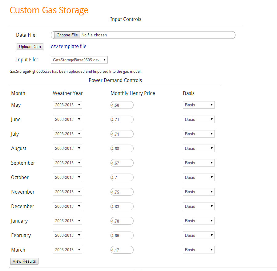
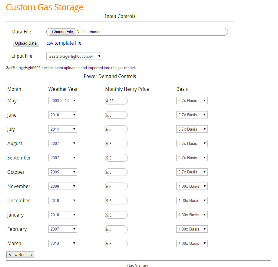
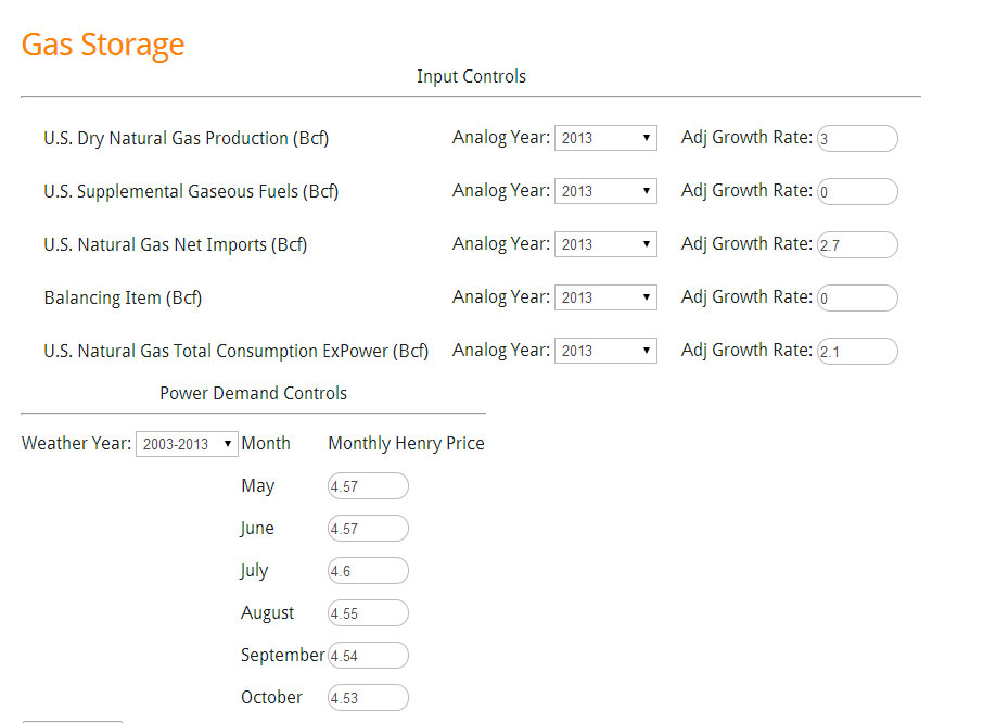
In this analysis, we will look at extreme demand cases as a result of weather and the impact it will have on gas storage and price. First, we need to establish a baseline to target an inventory level. For the baseline, production growth looks to be sustaining around 4%. I suspect this will hold given the price incentive. Net imports are up around 5% for the year and is projected to sustain. In terms of growth outside the power sector, demand is up close to 10%, but this is largely due to the weather extremes in the early part of the year. If you look at just May, which has more “normal” weather, demand is still up but only 7%. For the base run I sustain the 7% growth in demand. The baseline file was uploaded, and using the controls we set the price to the current forward curve strip (06/05/14) and used the average weather between 2003-2013. The below is the screenshot of the input setup.
Baseline Storage Inputs
(Click Image to Enlarge)
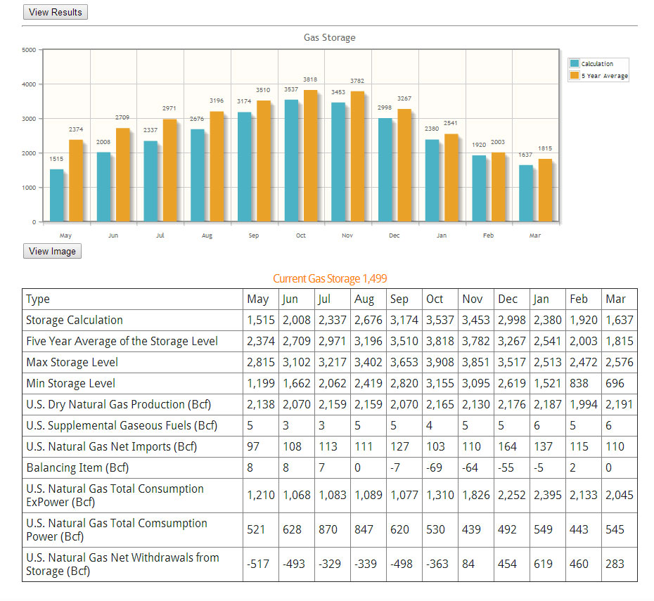
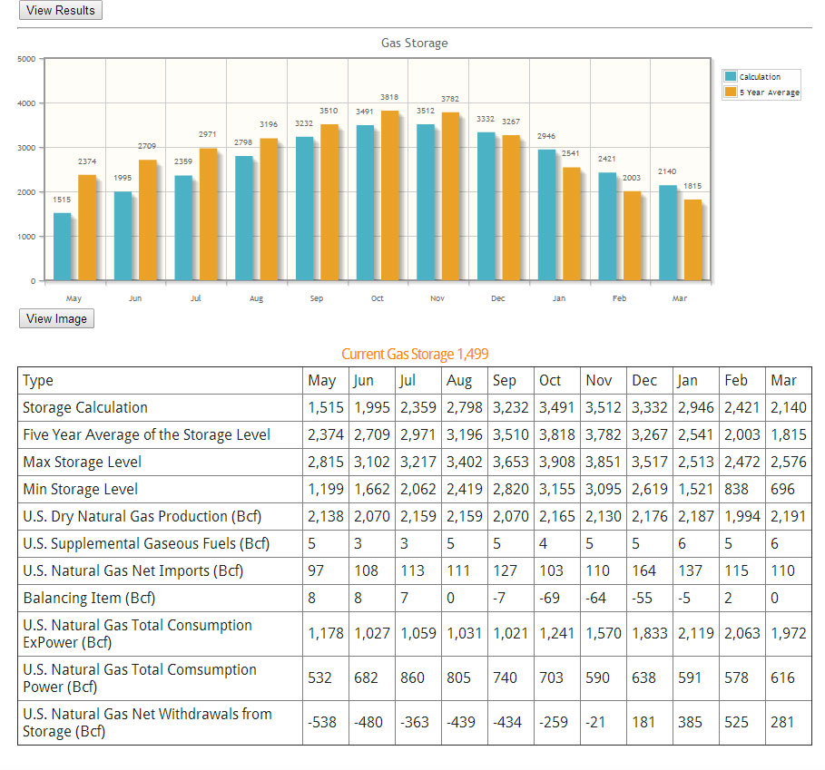
The results of the baseline is ending inventory in October around 3.5Tcf. This seems to be the market sentiment which puts the ending inventory 300 Bcf below the 5 year average. By the end of March the inventory is only 200 Bcf below the five year average. A screenshot of the result is below.
Baseline Storage Results
(Click Image to Enlarge)
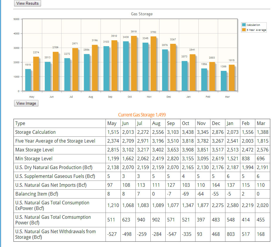
The results of high case show with the price response of $5.5/MMbtu ending October inventory was able to end at 3.4Tcf ~400 Bcf below five year average. By end of March the difference between five year average widens slightly – see below.
High Demand Case Results
(Click Image to Enlarge)
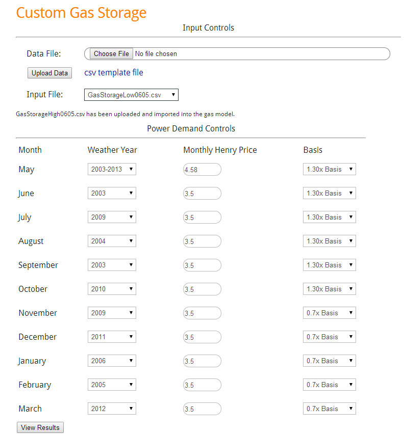
For the low extreme demand case, similar to the high extreme demand, only the demand components are adjusted. The change in demand outside the power sector from the baseline is narrow in the summer time. A weather analysis was performed to produce the drop in the winter time. This can be seen in the CSV file which was uploaded. For the power sector control, similar to the high demand, we chose the extreme low analog gas demand year. In addition we used a 1.3 factor for basis in summer and 0.7 factor in winter as indication of excess supply. Henry Hub was lowered to $3.5/MMbtu. The inputs are show below.
Low Case Inputs
(Click Image to Enlarge)
The result produces an ending inventory of 3.5 Tcf by the end of October, ~300Bcf below five year average. By the end of winter, the inventory levels surpass the five year average. In fact, there are months that actually set a new maximum inventory level. This likely indicates prices can potentially be lower than $3.50/MMbtu in those months. By the end of March, ending inventory is 2.1 Tcf which is 300 Bcf above five year average, but 400 Bcf below the five year maximum.
Low Case Results
(Click Image to Enlarge)
In conclusion, one can create a fundamental plausible scenario where gas prices go as high as $5.5 /MMbtu to as low as $3.5/MMbtu with changing weather as the key variable. Another study which can easily be done is creating a sensitivity on gas production. Given the current gas prices, we could see a surprise upside in gas production. At some point there is an equilibrium between production, price, and storage. With this tool one can easily investigate various scenarios to formulate greater knowledge in the gas market.
Hopefully I have demonstrated the power and ease of the tool to increase your knowledge.
Please contact me to schedule an online demo meeting[email protected] or 614-356-0484
We are focused not only on supplying answers, but empowering you to find answers.
Your Inspired Energy Consultant,
David
Founder & Principal
All Energy Consulting LLC
“Independent analysis and opinions without a bias.”
614-356-0484
[email protected]
blog: https://allenergyconsulting.com/blog/category/market-insights/
Gas Storage Model – Predicting $1/mmbtu Weather Risk
A new tool is added to the PMA package – an interactive gas storage model. The gas storage model value lies in the set of 35+ pre-set runs for the power sector enabling the user to create their own version of the future without having to wait. AEC specialty lies in the power modeling world. With this in mind the model allows users to change their assumptions in the other areas of the gas balance (e.g. production, imports, demand outside power sector, etc.).
A demo version is available http://allenergyconsulting.com/Data/DemoGasStorage.php . The demo gives the user all the capabilities other than changing the prices for Henry hub in the months of Jun-October. An example of using the tool is described below.
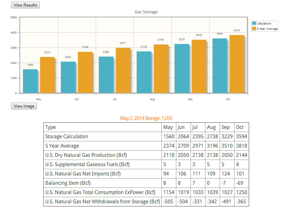
Recently the EIA did their own analysis of the end of summer inventory. In their analysis, they conclude ending storage level will be 3.4 TCF lower than the 5 year average of 3.8 TCF. To test our model, we used their assumptions outside the power sector. EIA assumed production only grew 3% from 2013. To put that into perspective, the 5 year average is closer to 3.8% and this was during very low price signals. EIA used imports that are much higher than the recent trend with an increase of 2.7%. 5 year average imports have declined by 15%. We also incorporated their price forecast – see below image.
Gas Storage Model Input (Click to Enlarge)
Using the 10 year average weather, our models show the final storage numbers closer to 3.6 TCF using all the assumptions. This was expected given the general under-estimation of the power sector to respond to significant rise in gas prices.
Gas Storage Model Output (Click to Enlarge)
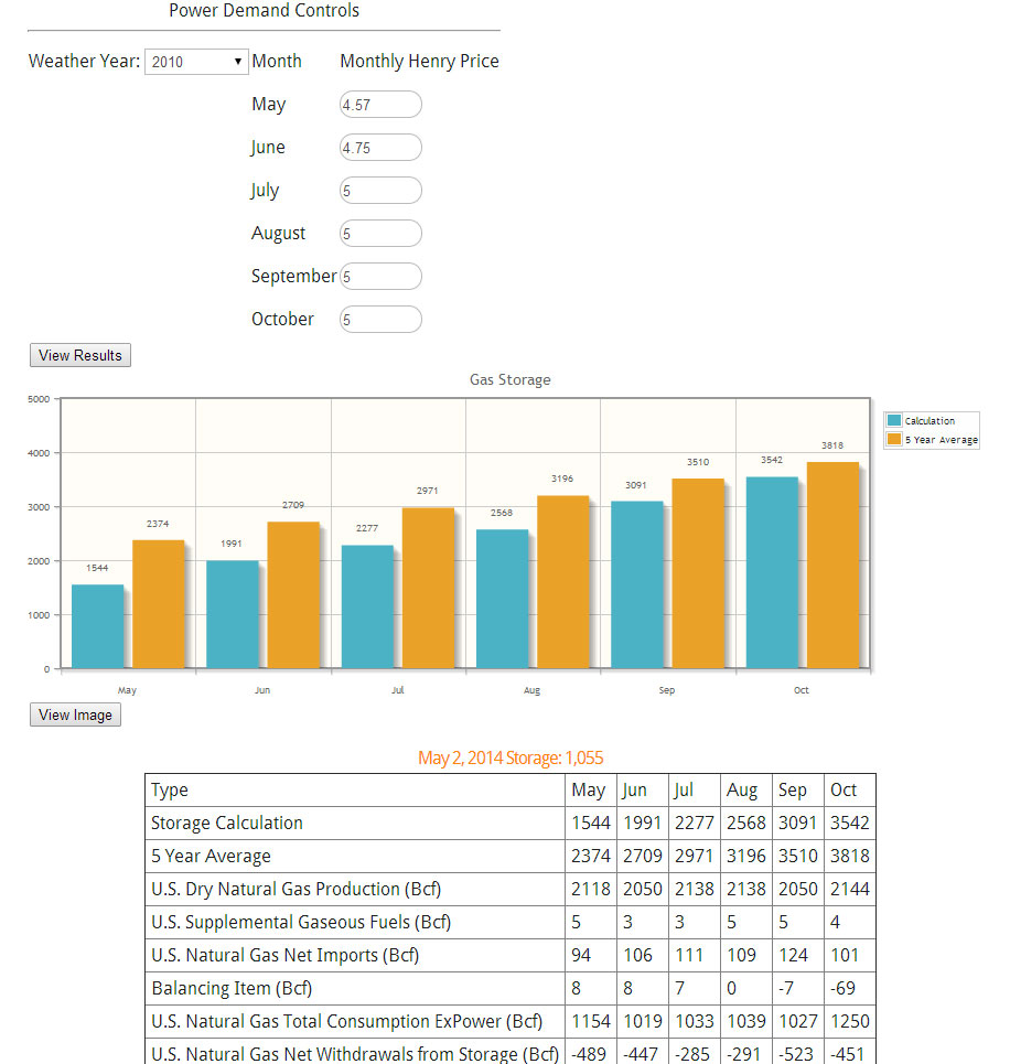
Another use for the model is to create your own gas price forecast by targeting a storage number. As an example, if we changed the weather to be an extremely hot summer, we can change the weather drop down to 2010 per our 10 year weather analysis report.
In this case, we had to change the gas prices in order to maintain a 3.5TCF ending inventory. The gas price that solved for this was $5/mmbtu. One can put even more finesse into the forecast by adding more seasonality than what was shown. In addition modifying the non-power demand would be a prudent task.
Gas Storage 2010 Weather Scenario (Click to Enlarge)
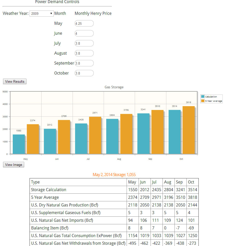
The opposite of 2010 would be 2009 weather. Applying the same technique and target of 3.5 TCF, we get a price level of $3.8/mmbtu.
Gas Storage 2009 Weather Scenario (Click to Enlarge)
Rather quickly, we now understand the weather risk involved in gas can amount to over $1/mmbtu.
The model does require updates since each week there is an update to the storage number. In addition, the relationships were established based on the April 22nd 2014 market prices. We plan to update the relationships monthly. The coming update for the model will include enhanced basis control plus be expanded to cover to the end of March of next year.
Besides the gas model, PMA subscribers get the daily files, and the study files. In addition, prime members receive-at no additional cost reports such as the the Summer 2014 Outlook report and the 10 year weather analysis. Subscribers also have the opportunity for free private consultations. Discussions can range from answering more detailed questions on the studies to discussing potential scenarios of the future.
Please contact me to schedule an online demo meeting [email protected] or 614-356-0484
We are focused not only on supplying answers, but empowering you to find answers.
Your Inspired Energy Consultant,
David
David K. Bellman
Founder & Principal
All Energy Consulting LLC
“Independent analysis and opinions without a bias.”
614-356-0484
[email protected]
blog: https://allenergyconsulting.com/blog/category/market-insights/
Sell Winter PJM-West? Trading & Risk Product
A common question is how can I use PMA in my organization? There are multiple ways PMA can help your organization including enhancing all focus on the gas, coal, and power markets. PMA can increase your fundamental understanding in the gas, coal, markets. PMA can help you evaluate generation assets and portfolios. PMA can also be used to evaluate risk and trading opportunities. In the following example, we will describe a simple case of how PMA can deliver a potential trading opportunity and be used to evaluate risk and reward.
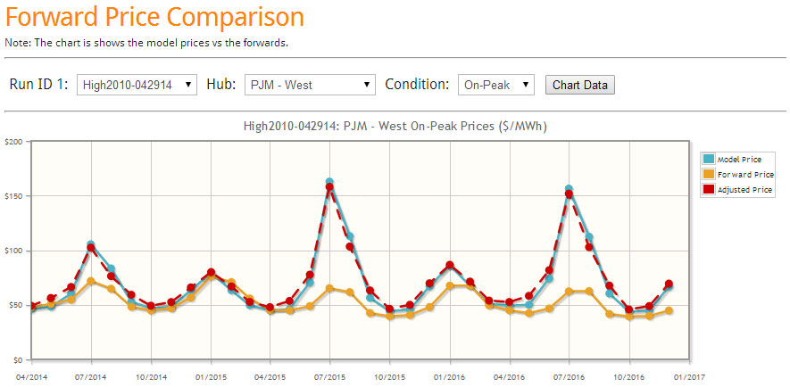
With the new online interface, one can quickly get an assessment of the model in relationship to the forward curve. PMA runs every day with the latest futures markets prices for natural gas and coal. Three scenarios are run each day – Base, High Power Price, and Low Power Price case. The Base uses a normalized weather based on 2003-2013. The high uses the 2010 weather pattern, and the low uses the 2009 weather pattern. The selection of these years are based on our 10 year weather analysis just completed a few weeks ago. The high and low also changes henry hub and retirement and builds plus forced outages – a complete description of the cases are available for our subscribers.
The following are direct screen shots from our latest online interface for the April 29th runs. Three lines are presented. The yellow solid line represents the forward curve. The blue solid line represents the model output. The dash red line represents the historical tendency of the model from our 4 year calibration run by month. In the example below, the model has a tendency to under-forecast the shoulder months- therefore the dash red line above the blue line.
Base Case (click image to enlarge)
In the Base Case, we can identify that this year summer and winter could be a potential sell given both red and blue line below the futures curve.
High Case (click image to enlarge)
In the High Case, the summer sell is not looking too good. If the summer temperatures are to be similar to 2010, and gas prices move up 50 cents and planned new builds fail to perform or deliver as expected, PJM West summer prices can blow up leaving the sell summer trade losing over $30/MWh in July. However, the winter trade shows a rather smaller worse case scenario of $5/MWh in January.
Low Case (click image to enlarge)
The Low Case represents the potential reward of the sell trade. In the summer, the potential gain in the sell trade is around $12/MWh for July. This is the same spread seen for the winter sell trade for January.
Clearly, the risk and reward view would point to the winter trade over the summer trade. I would suggest a few more next steps before exercising the winter trade. Potentially, I would identify a spread to be long to balance mitigating against any major catastrophic event such as major gas pipeline issue. This spread can come in the form of ON-OFF peak spread, location spread, to a heat rate trade. To identify the other side, one can easily research that by using the drop down menus and following the same analysis above. Another step I would take is to run additional price, weather, and outage scenarios. PMA subscribers have complete access to all this.
Besides the easy to use online interface, PMA subscribers get full access to the data files. PMA subscribers get the online access, the daily files, and the study files. In addition, prime members receive-at no additional cost reports such as presented above, the Summer 2014 Outlook report , the recent briefing on what is causing the gas demand drop, and where it is coming from. Subscribers also have the opportunity for free private consultations. Discussions can range from answering more detailed questions on the studies to discussing potential scenarios of the future.
A demo of the daily file is available with restricted viewing. Click here to download. Please contact me to schedule an online demo meeting[email protected] or 614-356-0484
We are focused not only on supplying answers, but empowering you to find answers.
Your Inspired Energy Consultant,
David
Founder & Principal
All Energy Consulting LLC
“Independent analysis and opinions without a bias.”
614-356-0484
[email protected]
blog: https://allenergyconsulting.com/blog/category/market-insights/


